One system for every surface.
Tessina UI is a token-driven React library — 87 accessible components that ship in light and dark, LTR and RTL, on every screen size. Design once, ship everywhere.
Built for real product work.
Every component is shaped by the screens teams actually ship — forms, feeds, dashboards, checkouts — not idealized demos.
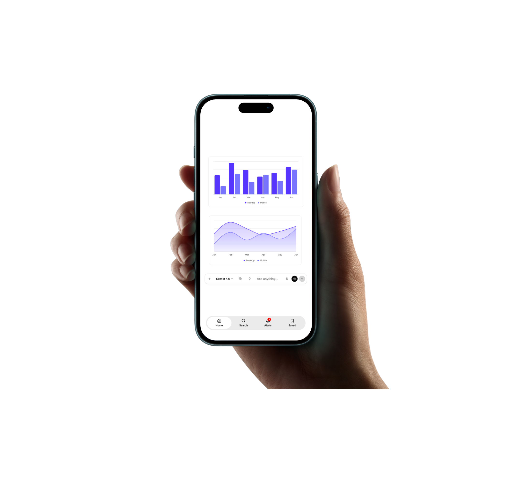
Powered by components.
Nine families, one design language. Every part reads the same tokens, so the whole interface moves together.
Endless combinations.
Stack the system however your product needs — the tokens keep every variant coherent.

Design.Build.Ship.
Designed to adapt.
Every color is a token, and every pairing is measured. Each card flips between two solids — the letters are the live WCAG grade in your current theme.
Made to scale.
From a single button to a full product — the same primitives, the same tokens, the same accessibility floor.
One button, every variant — sized, tinted, and focus-ringed by tokens.
One import away.